DeFiDocs is a news site that gamifies decentralized finance, an emerging digital financial infrastructure with a goal to eventually eliminate the need for a central bank. The DeFiDocs team approached us to design their desktop platform, a website where users can share articles and educational content about DeFi in exchange for collectible NFTs (non-fungible tokens).
Contribution
research
wireframing
prototyping
user testing
Client
DeFiDocs
2022

Straddling the line between news site and crypto-enthusiast hang-out spot.
With few reliable learning sources, the DeFi community has remained small. DeFi lending apps are complex and built for people who already understand the ins and outs of crypto.
With the hype surrounding cryptocurrency over the past few years, people are rushing to build platforms and protocols without thinking about the long-term sustainability of the technology. The results are hard-to-use platforms made for those who already have a deep understanding of the subject.
At the outset of this project, my team and I conducted a round of secondary research and interviewed five potential users to get insight on their knowledge of DeFi.
Only 16% of crypto investors feel that they fully understand the complexities of the industry.
The fast-changing nature of the crypto world leaves beginner enthusiasts afraid many aspects, such as NFTs, are untrustworthy.
Interviewees had varying levels of interest. Some were actively investing, while others were willing to give it a try if they had more information.
Following the interviews, I parsed the information into a few applicable categories—users’ views on crypto, how they became involved with it, their concerns and frustrations towards it, their concerns about learning the industry, their thoughts on NFTs and DeFi, and their general feelings toward crypto’s social communities.
From here, the team was able to develop three user personas: The Skeptic, The Investor, and The Enthusiast.
Mapping a journey
for every user.
Now that we had identified the target audience, it was time to get clear on what users wanted out of DeFiDocs. Using our previous research, I identified the main functions that the user is looking for from the product.
As a skeptic and new investor, I want to read brokerage and platform reviews, so that I can be aware of the best places to invest in.
As a skeptical and new user, I want to join welcoming and inclusive groups, so that I can connect with people in the same boat as me.
As a skeptical and impatient new user, I want to learn about crypto, defi, and NFTs in an engaging way, so that I don’t lose interest and motivation.
As an enthusiastic user, I want to share how I started investing in crypto, so that I can help people who are just starting.
As a new NFTs investor, I want to view a list of resources, so that I know where to start finding information.
Next came the sitemap. I focused on simplicity, in order to ensure that the DeFi learning process wouldn’t be any more complicated that it already is.

Low-Fidelity
Wireframes
The team then used our user flows to create low-fidelity wireframes, getting a rough idea of how the website would look.
I experimented with the information architecture and a few different UX choices, including a sidebar and the beginnings of a dark theme, before moving on to high-fidelity designs.

The DeFiDocs team had provided us with a few examples of the sort of UI they were looking for. Keeping their wishes in mind, I put together a moodboard and style guide for the site.
I was inspired by the bright lights and heavy contrast of cyberpunk imagery, but I knew the client was looking for something simple and user-friendly. I focused on clean, modern UI elements, using color to add flair and personality throughout the site.


High-Fidelity
Wireframes
The team collaborated on twenty-three high-fidelity wireframes, focusing on our user flows and the basic routes a user would take: signing up, reading and sharing an article, and joining and managing communities.
Since DeFiDocs did not have a digital platform prior to our collaboration, I didn’t have any content to work with, so I focused on providing their team with a variety of elements that could be used to share articles and educational content.
During the process, I first used color more heavily throughout the site, eventually paring back the designs to be more simplistic, letting the images on articles and community pages stand out against the minimal white background. I also scaled back on the different types of elements used, opting to reuse designs for things like cards throughout the site to maintain consistency and ease for the developers.

My teammate created a clickable prototype and put together a testing plan. We wanted to find out how user-friendly and intuitive our site was.
Objectives:
Uncover usability problems in red routes
Find out how long it takes users to complete tasks
Find out if users are able to complete tasks
Initial impressions of screens
Testing Questions/Tasks:
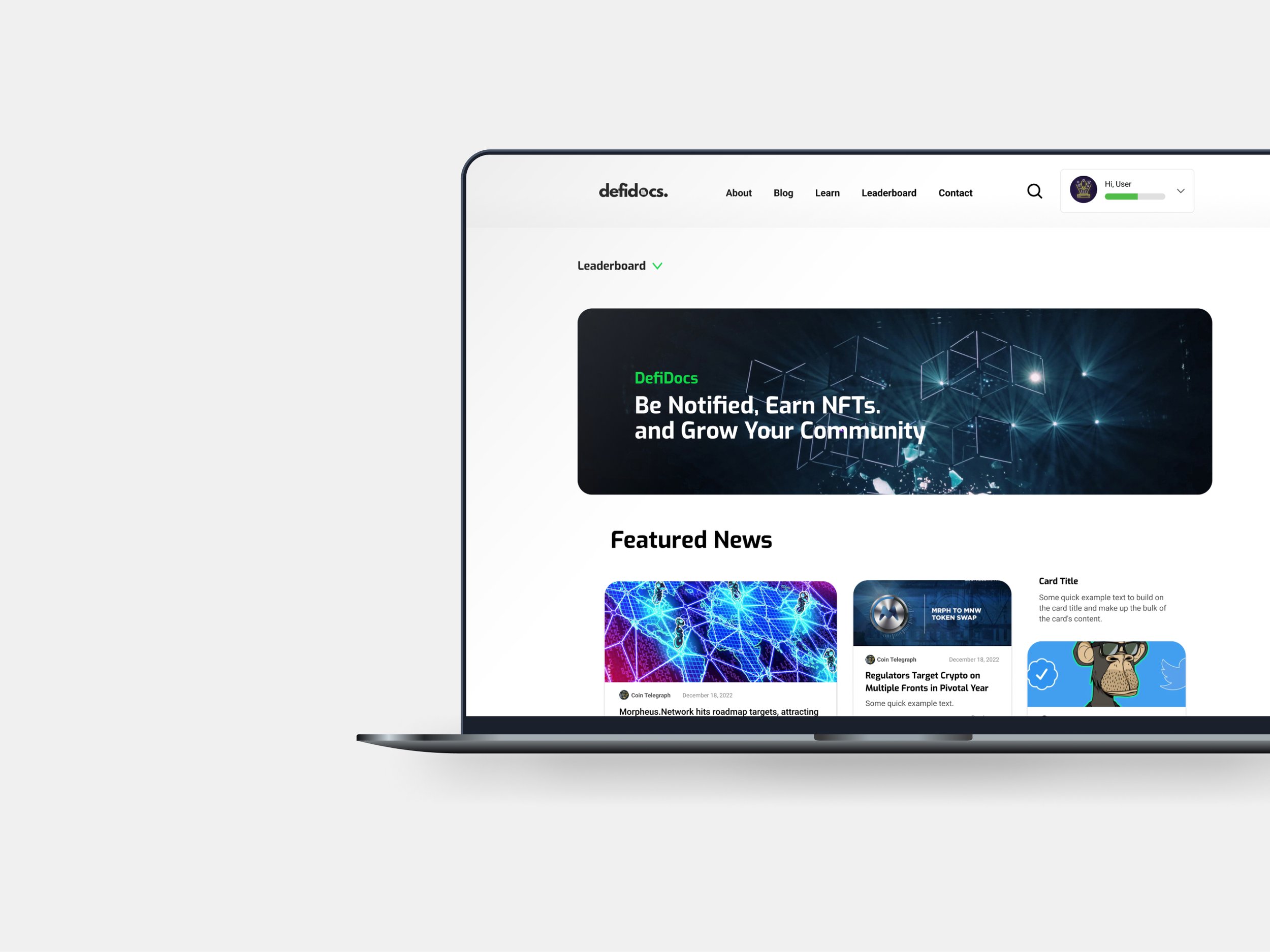
Can participants: sign up/login, open the leaderboard, learn about decentralized finance, visit communities they have joined, find earned badges & NFTs, use user profile settings, and find information about the company?
How are participants responding to the app's navigation?
What is preventing participants from completing tasks?
What features do participants find most valuable and why?
After conducting nine unmoderated usability tests, the team and I uncovered a few issues that impeded our users’ ability to navigate the site.
-
Participants were confused with the “allow people to mention you in chat” settings feature because it was in both the Profile Settings and the Notifications section.
Summary:
Some participants thought it was a great idea to have it under Profile Settings, while others said it made more sense to have that under the Notifications Settings section.
Some participants found it repetitive because this feature is in two place
Recommendations: Choose one place to have this feature located.
-
Participants thought there is something missing from the Sign In page or that it should be reworded.
Summary:
Participants were confused by the wording. They thought it would be changed to “Sign Up”.
Participants expected to see two screens or options: “Sign Up” and “Login”.
Recommendations: Change the wording to “Sign Up” and “Login”.
-
Participants expected to see more than six participants on the Leaderboard and some didn’t scroll down to learn more about how the Leaderboard works.
Summary:
Participants expected to see more than six people as leaders. They expected, for example, a Top 10 or even Top 50. Participants expected to see where they stand on the list. Some participants didn’t scroll all the way down to read about how to get on the leaderboard.
Recommendations: Add more leaders on the board and move the page description above the leaderboard so that users will read that section first.
