Circle is an app meant to facilitate a more “circular” economy within the sneaker industry. The current system values new-in-box shoes and leaves few options for sneakerheads to sell their lightly worn or less-than-perfect pairs. Circle fixes that by creating a second-hand marketplace with just as much functionality and customization as the big sneaker resale sites have.
Contribution
research
strategy
wireframing
prototyping
user testing
Year
2021

How can we bring value to secondhand sneakers while maintaining a luxe, authentic experience for sneakerheads?
Most people who sell sneakers independently use either GOAT or StockX, the two biggest resale marketplaces that specialize in sneakers and authenticate every purchase. Only GOAT allows users to sell second-hand or lightly used shoes, but the options are hidden beneath the pages advertising their new-in-box listings. While general resale sites such as eBay and Grailed allow you to post second-hand shoes, neither offers authentication, leaving users to gamble on the authenticity of their purchases or play it safe and buy new. The message to the sneaker community is clear—new is best, and unboxed sneakers have no value.
I started this project by conducting an initial round of secondary research, focused on three key aspects: sustainability in the sneaker industry, the rise of the counterfeit sneaker market, and the significance of sneaker culture.
60% of consumers
are looking to make more conscious purchasing decisions, proving that sustainability is important to the majority of shoppers.
Lack of laws and regulations
within the sneaker industry makes it easy for companies to take the least expensive route rather than putting the effort into creating a more eco-friendly product.
The rise of the counterfeit sneaker industry means lack of quality control and use of subpar materials, presenting a problem for both sustainability efforts and the average consumer.
Following this research, I interviewed 5 people to to get a better understanding of consumers’ thoughts and actions towards sustainable footwear.
After conducting the interviews, I was able to parse the information into five main categories—interviewees’ current shopping habits, their thoughts on corporate sustainability efforts, personal thoughts on sustainability, as well as both their likes and dislikes about the current sneaker culture.

The Collector and
The Functionalist
Through affinity and empathy mapping, I was able to uncover two personas that represented average target user.
The Collector is your classic sneaker enthusiast and sees his collection as a celebration of the art, design, and culture of the sneaker community.
The Functionalist doesn’t collect shoes religiously but still keeps up with the latest drops. When it comes to buying shoes, durability is her biggest concern.
Understanding the user’s needs
Using my previous research, I identified the main functions that my primary user is looking for.
As a user, I want:
to purchase shoes I know I will love and wear, so I can be confident my purchases won’t go to waste.
to know details about the shoes I am buying so I can be confident in their condition and authenticity.
to ensure my shoes are durable so I can use them for a long time.
to buy my sneakers from a reputable source so that I can know what I’m getting when I make a purchase.
a streamlined place to buy sneakers so I can ensure I am getting the best deal on the best product.
One main takeaway from my interview process was that many consumers have a bleak view of corporate sustainability; that is, they don’t trust large corporations to prioritize ethics and sustainability over profit. This specific finding steered me away from some of my ideas that involved highlighting companies and products that are made sustainably and toward a product that allowed consumers to get the most out of a product they were already using (i.e. a secondhand market).
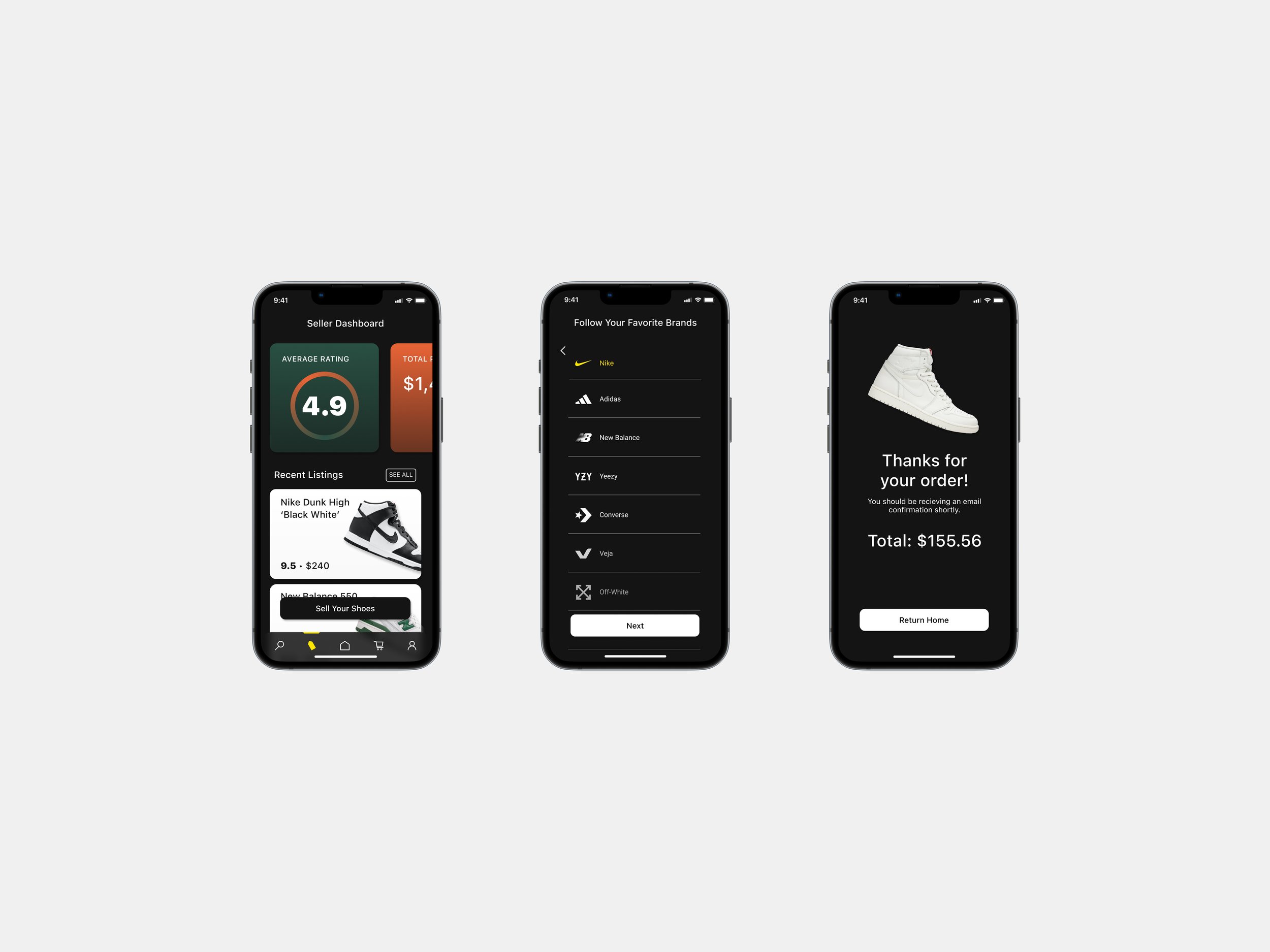
Now that I had a better idea of how to help my users, I created the sitemap. I focused on usability and simplicity, making sure that only features that would benefit the user were included. I knew I wanted users to be able to complete two main functions: purchase a pair of shoes and list a pair of shoes for sale.

Low-Fidelity Wireframes
Knowing e-commerce apps can often be busy and filled with information, low-fidelity screens allowed me to find a happy medium between overly simplistic and overstimulating. I knew I would need to use photos, but opting for cutouts, rather than full-screen images with busy backgrounds, helped keep the design minimal.
I then brought my sketches into Figma, using my initial ideas to create more precise and pixel-perfect outlines of my screens. This helped me get a better idea of how much information could fit on the screen, as well as how much information was too much.

A distinct brand and voice for the UI
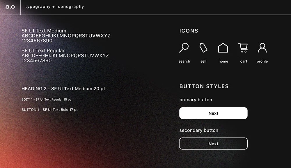
Inspired by the grit and authenticity of streetwear, I set out to create a style guide that reflected the unique do-it-yourself nature of sneaker culture. While I kept the general wireframes minimal and clean, bold accent colors and vintage-inspired typography gave the brand the individualistic element I craved while not overwhelming the user.


With the style guide finalized, I created multiple variations of the hi-fidelity screens and used a range of UI styles—including glassmorphism, a heavier use of gradients, and circular typography— before arriving at my final design.

Testing to ensure usability
After finalizing my high-fidelity screens, I built a clickable prototype in Figma outlining all major user flows.
With my prototype completed, I was ready to run usability tests. I wanted to ensure that my app was not only easy to navigate, but that the steps to complete tasks were as simple and efficient as possible.
Objectives:
Ensure readability of internal screens (i.e. homepage, item page)
Uncover usability problems in red routes
Testing Questions/Tasks:
Can users successfully sign up for an account?
Can users complete the checkout process?
Can users successfully navigate the secondhand shoe listings and choose a listing to purchase?
How do users respond to the homepage and other landing pages?
After conducting five usability tests, I confirmed that most users had little trouble navigating Circle. There were some minor issues that were uncovered during testing. I applied them to my final prototype, ensuring that any dev-ready files would be up to date.
-
The first two screens—the log-in and the sign-up screens—are too similar.
Summary:
It would take a few moments for users to understand that they were actually on a new screen when they pressed the “Create an Account” button.
Some users thought that their screen had froze or that it wasn’t working properly because they didn’t see a difference between the sign-up screen and the previous screen.
Recommendations: Create a sign-up page design that is distinct from the log-in screen.
-
Users noted that they could not tell exactly what the app’s purpose was until they’d gotten far into the user journey.
Summary:
Multiple users noted that until they searched for a specific pair of shoes, they could not tell that the app’s purpose was specifically to buy and sell shoes.
Recommendations: Tweak the first page to include a blurb/slogan that explains the app’s purpose.
-
Users noted that the listings did not have enough information listed to make them completely confident in their purchase.
Summary:
Because the listings page has no space for the seller to write their own description, a user was concerned that she didn’t know enough about the product to be completely confident in buying it.
Recommendations: Add a section on the seller page for the seller to type a short description. Then add that description to the listing page